
X-Sizer Stack
Interactive measuring utility stack.
Description
An interactive measuring utility stack to aid your webpage production.
X-Sizer is primarily a utility stack, to aid you while constructing your website. It allows you to retrieve exact sizes of elements within your page, so you can make informed decisions, such as, what is the optimal size image I need to place in this element?
The stack has 3 different modes, all of which serve their own purpose, and we demo each of these modes below.
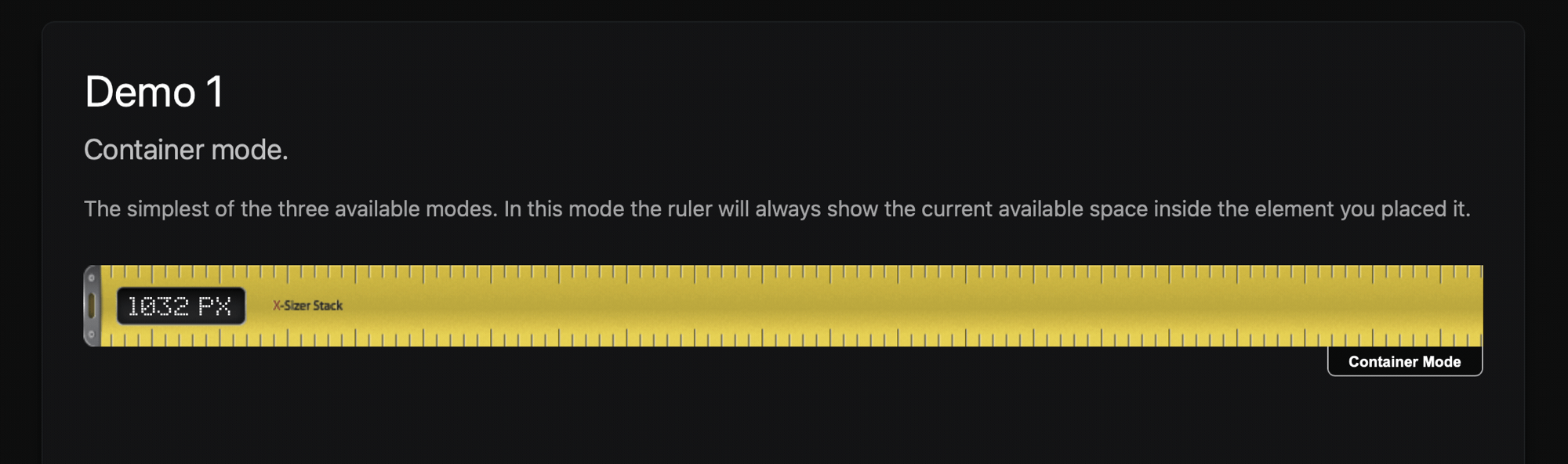
Demo 1
Container mode.
The simplest of the three available modes. In this mode the ruler will always show the current available space inside the element you placed it.
Demo 2
As wide as it gets mode.
In this mode, the ruler will only display the largest size it ever became. So you may resize the window from largest to smallest, and the ruler is constantly monitoring the situation, while elements grow and shine, and re-arrange themselves, the ruler is monitoring for the largest size it ever became.
The first ruler in the columns below is set to this mode.
Demo 3
Window mode.
In window mode….. Ah, lets just show you what window mode does…
Re-size the browser window to see the demos perform.
User Settings
A comprehensive overview of this stacks user settings.
The stack has three modes to choose from, detailed below.
- Measure Container
- Responsive Container
- Measure Window
Measure Container
- Place the stack inside any other stack.
- Preview the page.
- Re-size the window, and as the elements width changes, the ruler will display the current element width.
Responsive Container
- Place the stack inside any other stack.
- Preview the page.
- Re-size the window, and the ruler will only display the largest size it ever became during the window re-sizing..
Measure Window
- Place the stack inside any other stack.
- Preview the page.
- The ruler now fills the entire width of the window, and you may click and drag the ruler up and down the page.
- The ruler displays the current window width, and has some added feature of displaying the current scroll distance of the page, and the current top offset of the page to the top of the rulers current position.

Last modified %(last_mod)%