
Header Pro Stack
Header Pro is a huge step up from the default header stack.
Description
Header Pro is a huge step up from the default header stack.
Gives you the ability to realign the header at each device screen size,
Gives you total control over the header or part of the header text formatting, such as color and bold font. Using the text editor you can also add a link to the header text.
There are also super stylistic options Gradient text and image as text.
Standard Style Header Text

Responsive alignment control is available for all header styles.
This gives you the pro option of re-aligning the header text for each device size. We generally realign to the centre on mobile screen sizes.
Custom Style Header Text
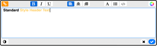
Set header colours and links in the text editor.
Unlike the standard header stack, you can add links, colours and formatting to your headers, in the text editor.
Gradient Style Header Text
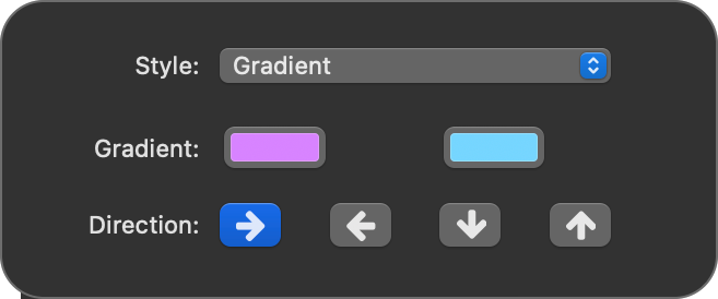
Create any colour gradient inside header text.
This style option is super on trend at the moment. It's a simple case of picking two colours and selecting your desired direction of the gradient.
Image Style Header Text
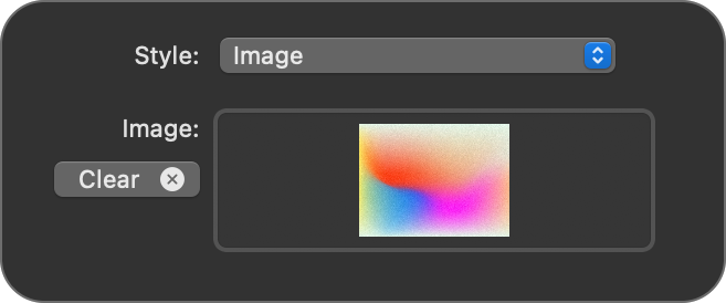
Place any image inside the text of you heading.
This style option is simple to implement by simply adding any image to an image well in the stacks settings when the image style is selected.
Turn any header into a link.
You can create a linked header by:
- Double clicking the text to open the editor.
- Select all or the portion of the text you with to be a link.
- Click the orange link icon in the top left hand corner of the text editor.
Paragraph text
Header pro can also do paragraph text.
Standard - Lorem ipsum dolor sit amet, sapien platea morbi dolor lacus nunc, nunc ullamcorper. Felis aliquet egestas vitae, nibh ante quis quis dolor sed mauris. Erat lectus sem ut lobortis, adipiscing ligula eleifend, sodales fringilla mattis dui nullam. Ac massa aliquet.
Gradient - Lorem ipsum dolor sit amet, sapien platea morbi dolor lacus nunc, nunc ullamcorper. Felis aliquet egestas vitae, nibh ante quis quis dolor sed mauris. Erat lectus sem ut lobortis, adipiscing ligula eleifend, sodales fringilla mattis dui nullam. Ac massa aliquet.
Image - Lorem ipsum dolor sit amet, sapien platea morbi dolor lacus nunc, nunc ullamcorper. Felis aliquet egestas vitae, nibh ante quis quis dolor sed mauris. Erat lectus sem ut lobortis, adipiscing ligula eleifend, sodales fringilla mattis dui nullam. Ac massa aliquet.
User Settings
A comprehensive overview of this stacks user settings.
Choose the type of header you'd like here:
H1, H2, H3, H4, H5, H6
You may increase the normal heading size by up to 300% on desktop.
On tablet, this would dynamically decrease to 200% the normal heading size.
And on mobile decrease again to 100% the normal heading size.
The tablet font size formula is:
(Desktop supersize - 100) / 2 + 100
Here you choose hw the stack will align it's contents at each device size.
Here you can customise at what screen size the stack sees the screen as a tablet or a mobile phone.
Here you choose the style of the header, as demonstrated in the above demos.
Here you can select a percentage that the text size will be reduced by on mobile devices. 100% (default) means no scaling, 50% the text will be half the size on mobile devices.
Please note some themes already have this feature built in. If yours does, then the stack allows the theme to control the text size.

Last modified %(last_mod)%